0:00
Hey everybody and welcome back to Excel
0:03
Wiz. In today's video, I'm going to show
0:05
you how you can create a heat map in
0:07
Excel just like the ones you can see
0:10
here. One of them is going to have no
0:13
values but with the color scales. The
0:15
second one down here is the one where
0:17
you have the color scales and you can
0:19
see the values as well. So, let me show
0:21
you how you can do this in less than 5
0:23
minutes. Let's get started.
0:26
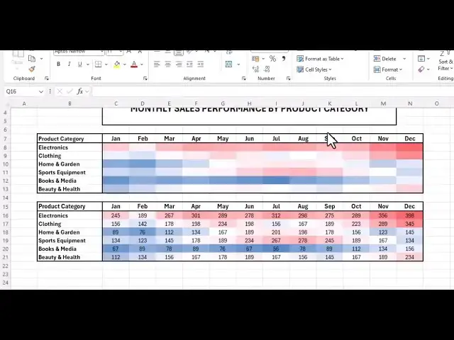
I'm working with monthly sales
0:28
performance by product category from
0:31
January to December for different uh
0:34
products. As you can see, I've got
0:36
electronics, clothing, home and garden,
0:38
sport, equipment, books and media,
0:40
beauty and health. So, what we need to
0:42
understand from this data is we want to
0:45
know which month had the highest uh
0:48
number of sales and which product that
0:51
was it. As you can see, it's not easy to
0:53
tell while you're looking at this data.
0:56
But when we use our heat map, it's going
0:59
to be very uh you're going to see this
1:02
very easily. So, let's uh do this. The
1:06
first step that you need to do,
1:08
highlight or select all your data
1:12
under styles, click on conditional
1:14
formatting and then click on color
1:17
scales and choose uh one of the colors
1:19
that you want. See uh the first one
1:22
green is the highest um and red yellow
1:26
is the least but we don't want to work
1:28
with that. Let's let's go and choose uh
1:31
blue and red. So click on that. So once
1:34
you click on it as you can see 398
1:38
electronic electronics were sold for 398
1:42
in December that was the highest and the
1:44
list you can see the list is blue which
1:48
is 56 and you can tell from the rest of
1:51
the data. So if you only want to see the
1:55
color scales without the values in it
1:58
this is what you can also do. So uh
2:01
select just select the values the values
2:04
alone right click and
2:08
click on format cells
2:10
under category click on custom uh on
2:14
general under type where we have general
2:17
uh type in your three semicolons
2:21
and click on okay. So once that's done
2:24
as you can see all the values have
2:26
disappeared and we only have the the
2:29
color scales. So by using this data now
2:31
you can read and see with the red being
2:34
the highest and blue being the least you
2:36
can tell which month and which products
2:39
had the most sales and the least sales.
2:42
So that's it. That's how you can create
2:44
an heat map in Excel. If you have more
2:47
questions, please feel free to leave it
2:49
in the comment section. And if you have
2:51
a specific video you want us to do,
2:54
please feel free also to leave it in the
2:56
comment down section. Do not forget to
2:58
like, subscribe, and as always, thank
3:00
you very much for watching and see you
3:02
again in the next video. Goodbye.