Up next in 10

How to create a Bullet Chart in Excel
Jul 31, 2025
Learn how to create a professional Bullet Chart in Excel with this easy step-by-step tutorial! Bullet charts are a powerful way to visualize performance against targets, making them perfect for dashboards, KPI reports, and business presentations. In this video, you'll discover how to build a bullet chart using basic Excel tools—no special add-ins or complex formulas needed. Whether you're tracking sales, productivity, or project milestones, this guide will help you present your data clearly and effectively. Great for beginners and Excel pros alike!
Show More Show Less View Video Transcript
0:01
Hi everybody and welcome back to Excel
0:04
Wiz. In today's video, I'm going to show
0:06
you how to create a bullet chart in
0:08
Excel using two different methods. The
0:11
first method is overlapping bullet chart
0:13
and the second one is a bullet chart
0:15
with a target line. As you can see here,
0:18
there are two different charts, but they
0:20
all conveying the same message. That's
0:22
that different people can understand it
0:25
differently. So let's get started and
0:28
see how you can create such a bullet
0:30
chart.
0:32
So let's begin with the first one that's
0:35
the overlapping bullet chart. The first
0:38
thing as you can see we have data that
0:40
has uh category sales customer
0:43
satisfaction and productivity as well as
0:46
the value that they're supposed to hit
0:48
and the target that they the values that
0:50
they had the target that they were
0:52
supposed to hit and the different
0:55
numbers that show whether they performed
0:57
fairly poorly or good. So the first
1:00
thing we are going to select the first
1:03
three columns that's category value and
1:05
target. Select that.
1:08
Go on insert and insert a 2D column.
1:12
Let's choose the first one. So once you
1:15
get this
1:17
uh click on the blue that's the value uh
1:21
right click and format data series.
1:26
Once once you're here under series
1:28
options uh reduce your gap width from
1:31
219 to around something like 40.
1:36
So all the way to 40.
1:40
40. There we go. And then ensure that
1:42
you change your plot series from the
1:45
primary axis to the secondary axis. Once
1:49
you do that, as you can see, they
1:51
overlap. Um once they overlap, change,
1:54
sorry, go back.
1:57
Format data series. Once they overlap,
2:00
change your gap width now to around um
2:04
150.
2:06
Change it to 150. And as you can see
2:10
they all they overlap. So they are in
2:13
all of them are inside.
2:16
The next thing that we can do we can now
2:19
just do simple formatting. Let's get rid
2:22
of this
2:24
under the axis. Let's get rid of the
2:26
secondary axis. That's gone. We can also
2:29
get rid of the grid lines. Um we also
2:32
don't need the chart title. So we check
2:35
that off and as you can see this is what
2:38
we got. We can make this more readable.
2:41
Right click and then format your axis.
2:46
Uh click on tick marks under major type
2:51
choose outside so it's easier to know uh
2:56
where uh what is where. Uh so sorry one
3:01
more thing we can actually do we can put
3:04
our legend all the way to the top so you
3:07
can a person can easily tell what's
3:09
what. So we've got uh the orange
3:14
as target and the blue as value. So you
3:16
can see under sales they did not meet
3:19
the target and customer satisfaction
3:22
they also did not meet the target but in
3:24
terms of productivity they went beyond
3:27
target. So you can easily um interpret
3:31
this data this quick.
3:34
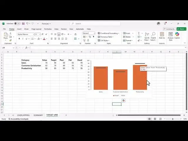
The second way we can do this is by the
3:36
use of a bullet with target line. So a
3:39
bullet chart with a target line. So what
3:41
we are going to do, we going to repeat
3:43
the same process but just uh change a
3:46
few things. As you can see we are going
3:49
to select the category value and target.
3:53
Click on insert
3:55
and on chart. Choose the 2D chart.
4:00
We've got our 2D chart in this case. Now
4:04
we are going to
4:06
format data series.
4:10
Change our gap just the same way we did
4:12
with the previous one. Change it to
4:15
around 40.
4:17
[Music]
4:19
So around 40.
4:21
So that's it. And then we move on to the
4:25
second one. And now
4:30
on the second one, let's change it to
4:33
secondary axis.
4:35
And as you can see, this is what we get.
4:38
So now what we're going to do different
4:41
from the first one, we are going to
4:43
change the value to be now
4:48
you change the data the chart type for
4:51
value from clustered column.
4:55
We can change it to scatter.
4:58
Click on okay. And as you can see it now
5:02
turns into a very small dot. So select
5:06
them
5:09
and then once you select them click on
5:13
chart design
5:16
on the left. Click on add chart element
5:19
and let's uh error bars and then click
5:23
on standard error bars. So what you're
5:26
going to do you we're going to try and
5:29
get rid of the vertical line.
5:33
Click on it and delete and then right
5:36
click the line that's left and format
5:39
error bar.
5:41
So under end style let's change it to no
5:45
cap. And then under fixed value let
5:49
let's give it for it to have something
5:52
bigger let or smaller let's give it 0.25
5:54
25
5:56
for the fixed value.
6:05
We can uh increase
6:09
we can increase format data series.
6:12
Let's try and increase the size of this
6:16
error bar.
6:21
Click on marker.
6:28
So, let's let's increase our wind all
6:30
the way to
6:33
to three.
6:36
That's That's better. We also need to
6:39
get rid of this small. We can change uh
6:41
the color. Maybe let's give it a green.
6:45
Our marker is going to be in cream
6:48
color.
6:52
And then let's go on marker options. We
6:55
want to get rid of this small dot. So
6:57
keep it as none.
7:01
And
7:02
there we go. So you can change the size
7:06
of this
7:08
format error bar.
7:14
So the wind let's increase it to
7:18
three
7:20
or 3.25.
7:22
There you go.
7:24
So this is the same thing that it it
7:28
gives us the same results like the
7:30
overlapping bullet as you can see
7:34
uh the target is in green. The target is
7:37
in orange and the value is in in green.
7:41
So, none of these people were able to to
7:44
meet their targets.
7:46
And we can actually do a little bit of
7:49
formatting. Let's get rid of the
7:51
secondary axis.
7:53
Get rid of that. We can also get rid of
7:55
the grid lines and the chart title. We
8:00
also don't need this.
8:02
And then let's
8:05
format um
8:07
our axis
8:11
and tick marks on major type. Let's
8:14
change this to
8:17
major type.
8:19
Let's change it to outside. You can
8:22
change the the different color or
8:25
something else, but that's all we need.
8:28
So
8:30
as you can see now we've got um sales
8:33
people they did not meet the target
8:37
customer satisfaction was not met but in
8:40
productivity they did meet the their
8:43
target. So that's how you actually
8:45
create a bullet chart in Excel using the
8:48
two uh different methods. So, if you've
8:51
got a question, please feel free to
8:53
leave it in the comment section. And if
8:55
you'd like us to create a different
8:57
video of doing the same bullet chart,
9:01
but now with a performance banding,
9:04
please give us a comment in the comment
9:06
section and we'll definitely do it for
9:08
you. And as always, thank you very much
9:10
for watching and see you again in the
9:13
next video. And I hope this was very
9:15
informative for you. Goodbye.