Up next in 10

How to Make a Pareto Chart in Excel Super Fast!
Jun 8, 2025
Want to quickly identify the biggest factors impacting your results? In this video, we’ll show you how to create a Pareto Chart in Excel, a powerful tool based on the 80/20 rule. Whether you're analyzing defects, sales, or customer complaints, a Pareto Chart helps you focus on what really matters.
We'll guide you step-by-step through setting up your data, inserting the chart, and customizing it to make your insights crystal clear. No advanced Excel skills needed—just follow along and boost your data analysis game in minutes!
Learn more @: http://excelweez.com/
Show More Show Less View Video Transcript
0:00
hi everyone and welcome back to Excel
0:03
Liz in today's video I'm going to show
0:05
you how to create a parto chart in Excel
0:08
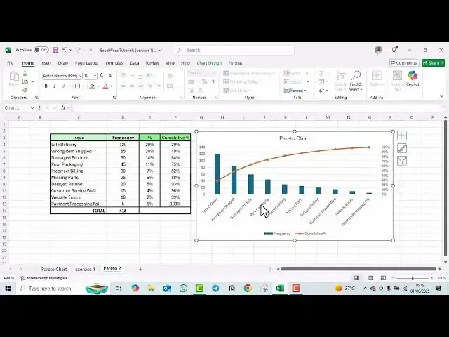
just like the one we have here um let's
0:12
get started so to begin with a parto
0:16
chart normally is a combination of a bar
0:19
graph and a line that helps identify the
0:22
most significant factors in a data set
0:25
for example in this chart parto chart
0:27
that we did I did earlier you got to see
0:30
we have the back graphs in blue and the
0:33
line in orange so normally the parto
0:36
chart actually goes uh relies on the
0:39
8020 rule meaning here where we have the
0:42
80% if we get a line crossing here and
0:46
another one down here all the values on
0:48
the left are going to show you that this
0:50
is the most significant data set that we
0:53
actually need so let's get started and
0:56
see how we can create one paral chart
0:59
just like
1:00
this so first ensure that you've got
1:03
your data in this particular example
1:05
I've got issue and frequency the second
1:08
thing that I'm going to calculate now is
1:13
um the
1:24
percentage so for this example we'll
1:27
need to calculate the percentage as well
1:30
and the other thing we'll need to
1:31
calculate is the cumulative percentage
1:44
so these are the two things that we'll
1:46
need to to calculate this hold
1:54
on that's much better so the first step
1:58
that we are going to do is sort our data
2:01
in descending on order as we can see
2:03
already I this data is already arranged
2:08
in a deciding order that is from the
2:10
highest to the lowest this is something
2:12
that you if your data is arranged in
2:15
different ways ensure that's done the
2:17
second thing we are going to change our
2:20
frequency here into percentage and the
2:23
first thing for in order for us to do
2:25
that we will just calculate um the total
2:31
we'll just calculate the total frequency
2:44
first so to calculate the total of
2:47
course we use the sum
2:58
formula and as you can see our total is
3:01
415
3:18
now that you have that done to calculate
3:20
the percentage we we take we start
3:24
with the 120 divided by the
3:30
total and then we'll get 0 this uh
3:34
decimal number and then we have to
3:37
change it into a percentage and we'll
3:40
get 29% so we'll have to do the same we
3:44
just drag all the way to get uh the rest
3:49
but as you can see there's an error so
3:51
what we can do in between in our formula
3:54
bar in between D4 we are going to add
3:58
just um a dollar
4:01
sign and once that's
4:05
done we can come back and drag it
4:09
again and now we'll have our percentages
4:13
um done the next step after this we are
4:17
now going to calculate the cumulative
4:19
percentage to calculate the cumulative
4:23
percentages we are going to start with
4:25
the first with the first one with the
4:29
first percentage which is 29% it's going
4:32
to be uh the first one so we just have
4:36
to select it
4:37
and enter the second one now is going to
4:41
be um this
4:45
29% we will have the first cumulative
4:48
percentage
4:51
uh
4:52
plus the second one which is going to
4:56
give you 49 and we'll have the same
4:59
going down one so drag and drop
5:05
and to make sure that you to make sure
5:08
that you have everything right the last
5:10
cumulative percentage is supposed to be
5:13
100% so ensure that's done so now we are
5:17
done with our
5:27
table we are done with our table the
5:30
second the next step that you are going
5:32
to do now is to create is to add our
5:38
chart in order for us to add our chart
5:41
we are going to select issue frequency
5:44
and the cumulative percentage because
5:46
this is now the data that you're going
5:48
to use to create our chart
5:50
so select
5:53
it and then just skip the percentage and
5:57
go straight
5:59
uh hit your control and select the third
6:04
the cumulative percentage column there
6:08
we go next step click on insert and then
6:12
look for object
6:16
uh sorry look for your chart in this we
6:19
are going to insert a a 2D column chart
6:23
here we have there we go so as you can
6:27
see we got our table you can just click
6:30
on the title to to rename
6:34
it let's call our
6:37
chart chart
6:49
so once that's done we are going now to
6:53
change our cumulative percentage into a
6:56
line so the first we we are supposed to
6:59
just click on the our cumulative
7:01
percentage is the one in in orange so we
7:06
can enlarge this
7:12
click on the cumulative percentage
7:17
end and now change series chart type
7:21
click on change series chart
7:24
type once you get this um we because we
7:28
are now dealing with cumulative percent
7:31
we want to change it from a clustered
7:33
column to now a line you can choose any
7:36
any line let's take the one with line
7:39
with markers and then we also want to
7:42
ensure that uh they are not on the same
7:45
axis so we are going to change the
7:47
cumulative percentage into a secondary
7:50
axis so this is why we have to you have
7:53
to ensure your secondary axis is ticked
7:55
click on
7:57
okay and as you can see here we've got
8:00
um our cumulative percentage and our
8:04
frequency in blue but as you can see
8:06
it's not fully 100% as you can see the
8:11
cumulative percent is supposed to be
8:13
100% so what you're going to do you're
8:15
going to click on this right click and
8:18
then format your
8:20
axis once you format your axis just um
8:24
ensure that your maximum is only one and
8:28
then click enter
8:40
so as you can see our now parto chart
8:45
has it's now
8:49
correct it's exactly at 100% so this is
8:53
now how you create a parto chart in
8:56
Excel it's it's actually simple all you
8:59
have to do is to ensure that you have
9:01
your cumulative percentage right and to
9:04
100%
#Statistics