
Excel Dashboard is one of the most popular method to analyze and visualize data. Excel contains hundreds of features that helpful when it comes to creating Excel Dashboards. From formulas, to charts and Macros, all these tools lead to creating comprehensive and decisive dashboards.
In this article, I will guide you on how to create an Excel dashboard and provide you with a free template.
What is an Excel Dashboard?
An Excel Dashboard refers to a one-page report that helps business leaders, analysts, and managers track key metrics and KPIs in order to make decisions.
Although a dashboard is often referred to as a report, not all reports are dashboards. The main difference is that a report does not answer user-specific queries. Instead, it shows the general performance. If the manager would like to find the best-performing region or product, a report cannot provide these questions
Conversely, a dashboard is created using a report; hence it goes deep into details, helping answer specific queries such as the best-performing regions or products in a nice visual presentation
In layman’s terms, a dashboard is a go-to place when looking for key metrics.
For example, the car dashboard displays all the important data, such as speed, fuel level, safety, and battery level. The speedometer in the dashboard displays the speed in a graphical or meter design for easy grasping.
Same as a car dashboard, the Excel Dashboard summarizes huge chunks of data and displays sit in a graphical or tabular style. The most popular charts to display on the Excel Dashboard are pie charts, line graphs, Bar Graphs, Histograms, Waterfall graphs, and combo graphs.
Tips for Creating an Excel Dashboard
You need to prepare several things before preparing an Excel Dashboard. These things will help you prepare a dashboard that is accurate, and that answers all the important queries.
Understand the purpose of the dashboard
The first question you need to ask yourself as soon as you get the data is. What purpose is this Excel dashboard going to serve? What do the stakeholders want to visualize? Do they need to track these metrics one time only or on a Regular Basis? By understanding the purpose of the dashboard and asking the right questions then, you will be able to create a useful dashboard.
Find the data source
Data can come in various formats and languages. Furthermore, the data source may be frequently updated or not. Therefore if you are to create an up-to-date Excel Dashboard, then you need to ask yourself questions about the data source. For example, who owns it, how frequently it is updated, and its format.
Understand the user/client
The Excel Dashboard can change depending on who the audience is. For instance, a dashboard for managers may differ from a dashboard for investors or customers. The manager may want to look at performance metrics while customers be focused on other metrics.
Understand the data and the update frequency
Before creating the Excel Dashboard, you need to understand how often the data will be updated. This can be a game changer in your dashboard in order to accommodate future updates. If the data will be read one time only, then there is no need to update it. But if you are working on a live dashboard, then you need to consider automation.
How to create an Excel Dashboard
1. Design your Workbook
When designing the workbook, it is important to separate the raw data, chart data, and the dashboard. Start by creating three worksheets. Name the first raw data, the second chart data, and the last dashboard.

2. Import data
Depending on the file format of the data source, you can choose various methods. For instance, if it’s a CSV, JSON, or Web format, you can use the internal Excel data Importer feature.
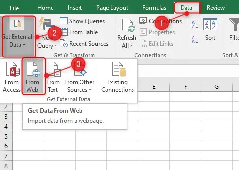
To import external data, click on the data Tab, Click the External Data Drop Down, then select the source.

In case you don’t see your preferred data source on this page, click from other sources. This will display all the remaining sources.

In this tutorial, we shall use the 2020 US elections data to create our dashboard. You can follow along by importing this page to your Excel Worksheet.
Since we are importing the data from a webpage, you need to click From Web under the Get External Data Section
After clicking on Web, a web browser will pop up. Use it to open the webpage containing your data. You can either enter the full address or use the Search Bar.
After opening the webpage, click on the import button, which is located at the bottom right corner.

3. Clean the Excel Dashboard data
Not all data will be ready to use. In some instances, you need to clean the data so that the dashboard can be complete and accurate. For example, you may be required to remove leading zeroes, spaces, or special characters. Furthermore, you can clean the data that you don’t need.
For instance, after importing a webpage in Excel, it comes will unnecessary data such as footer and header credits. This is what the data looks like after cleaning.

4. Identify the charts to use on the dashboards
A dashboard cannot be complete without charts. The most popular charts to use on Dashboards include Pie Chart, Histograms, Bar Graph, Line Graph, and Maps. You can also use Gantt charts to show the project’s progress.
5. Create a Chart
Before creating a chart, we need to set up a table for the chart. Open the second Excel sheet named chart data and create a table for the first chart. Note that a dashboard can contain several charts visualizing various elements.
We have created our first table using only the percentage of votes.

Now we can move on to the next step and create our first chart. In this case, we will create a pie chart to visualize how many votes each candidate received.
To create a pie chart, all you need to do is to click on the Insert tab and then select a pie chart under the Charts section.

A blank pie chart canvas will be created on your dashboard page. Now right-click to select the data you wish to appear on the pie chart

On the pop-up menu, select the range containing the table we have just created on the chart data sheet and press the okay

Congratulations on creating the first chart of your dashboard.

Now we can create a title for this chart on the dashboard and data labels for easy visualizing

Next, we can add another chart, such as a Histogram, to show the number of votes vs. Electro college Votes
First, we will create the table under the Chart Data section.

As you can see from the image above, the dashboard is getting in shape after adding a third set of data. You can add as many more charts and tables as you wish on the dashboard, including maps and line graphs.

Download Free Excel Dashboard Template
Final Thoughts
A dashboard acts as a unique report that visualizes complex data making it easy for managers and executives to make decisions. The dashboard is easy to understand since it uses charts and tables to summarize the data. It can be used across various industries for decision-making.
Discover more from Excel Wizard
Subscribe to get the latest posts sent to your email.